
At Nijusan Studio, illustration is not our main trade — and we’re the first to admit it. We are designers, makers, and problem-solvers who move between disciplines: 3D printing, merchandising, visual identity, and sometimes… illustration. Not because we claim to be the best at it, but because certain stories deserve to be told in a personal, crafted way.
This illustration for Pedro is one of those stories.
Starting with the Story
Before drawing anything, we listened.
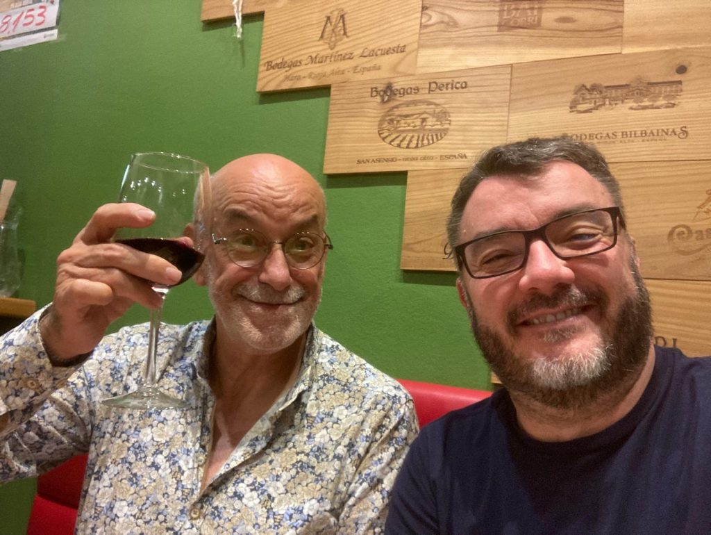
Our friend Ramón wanted to introduce his beloved friend Pedro.
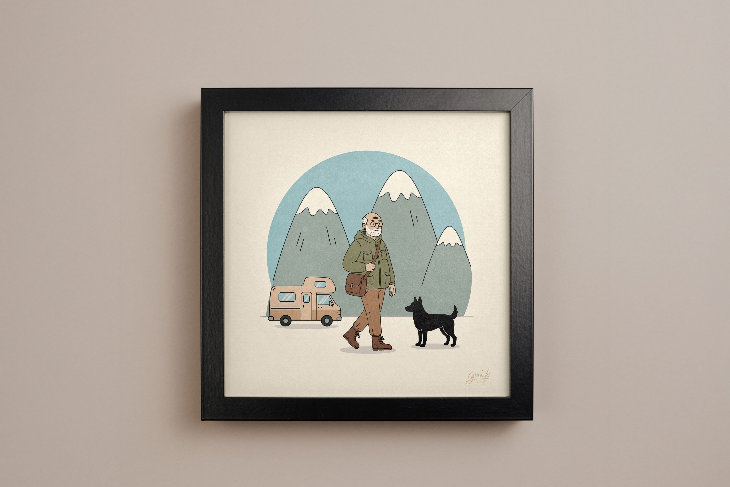
Pedro’s story came to us through small but meaningful details: a life dedicated to humanitarian work, a deep connection with the mountains and snow, a love for skiing, years of travel, and a camper van that represents freedom and movement. Alongside him, always present, the memory of his dog — a quiet but essential part of the scene.
The goal was never realism. It was about capturing a feeling: calm, warmth, and the sense of walking forward with everything that matters close by.
Sketching and Exploration
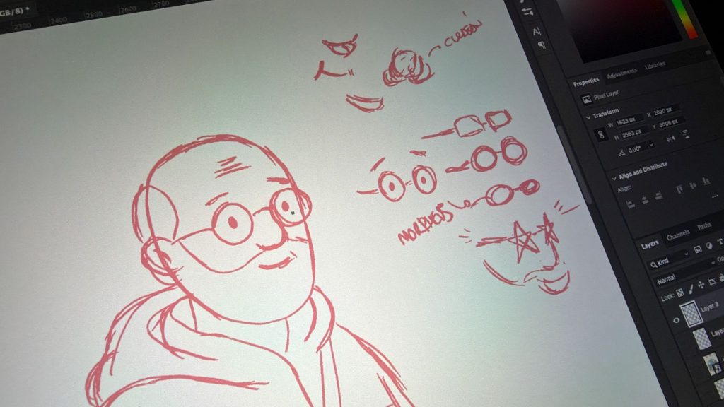
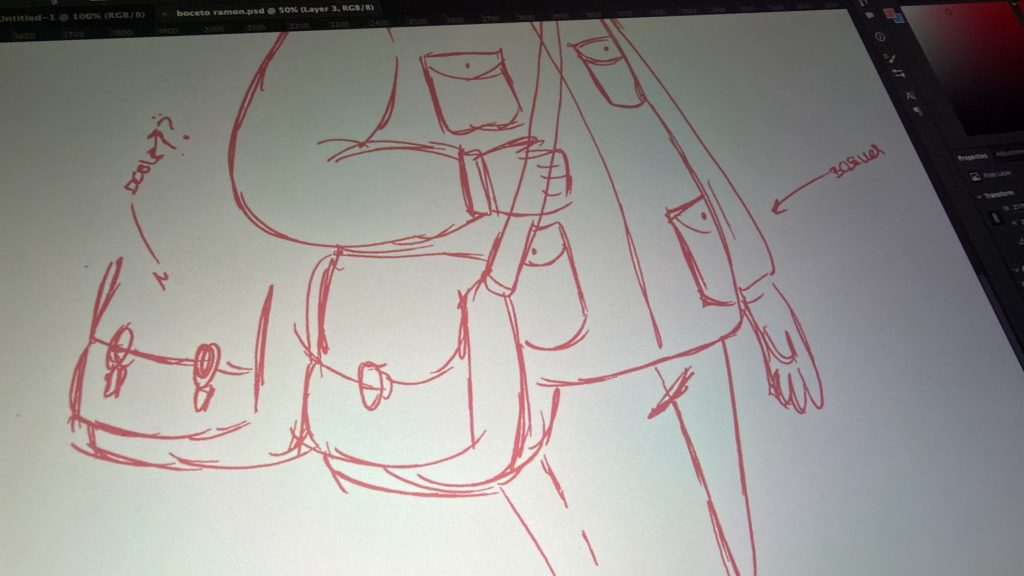
We began with rough pencil sketches, focusing on posture, proportions, and expression. At this stage, nothing is precious — faces change, glasses move, jackets grow pockets, and accessories appear and disappear.
The early sketches helped us define:
- A friendly, approachable silhouette
- A slightly formal but practical outfit
- A relaxed walking pose, suggesting an ongoing journey
We also explored secondary elements separately: the dog’s silhouette, the camper van, and the mountain shapes. These were intentionally kept simple, almost symbolic, to avoid visual noise.
Building the Scene
Once the character felt right, we tested compositions. Should Pedro be centered? Should the dog look at him or forward? How present should the van be?
The final composition places all elements on the same visual plane:
- Pedro walking forward
- The dog slightly turned toward him
- The camper van resting behind, not dominating the scene
- Snow-capped mountains framing everything softly
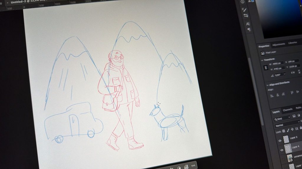
The mountains were drawn with minimal detail, acting as a backdrop rather than a focal point — a quiet nod to his love for snow and skiing.
Color, Line, and Balance
Color tests followed. We chose a muted, warm palette: greens, browns, soft blues, and off-white backgrounds. Nothing too saturated, nothing loud.
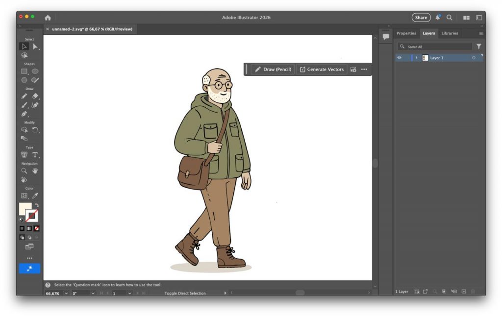
The line work remains clean and consistent, avoiding excessive texture. This was a conscious choice to keep the illustration timeless and printable — whether framed, reproduced, or scaled.
Final Illustration
The final piece is not about technical virtuosity. It’s about intention.
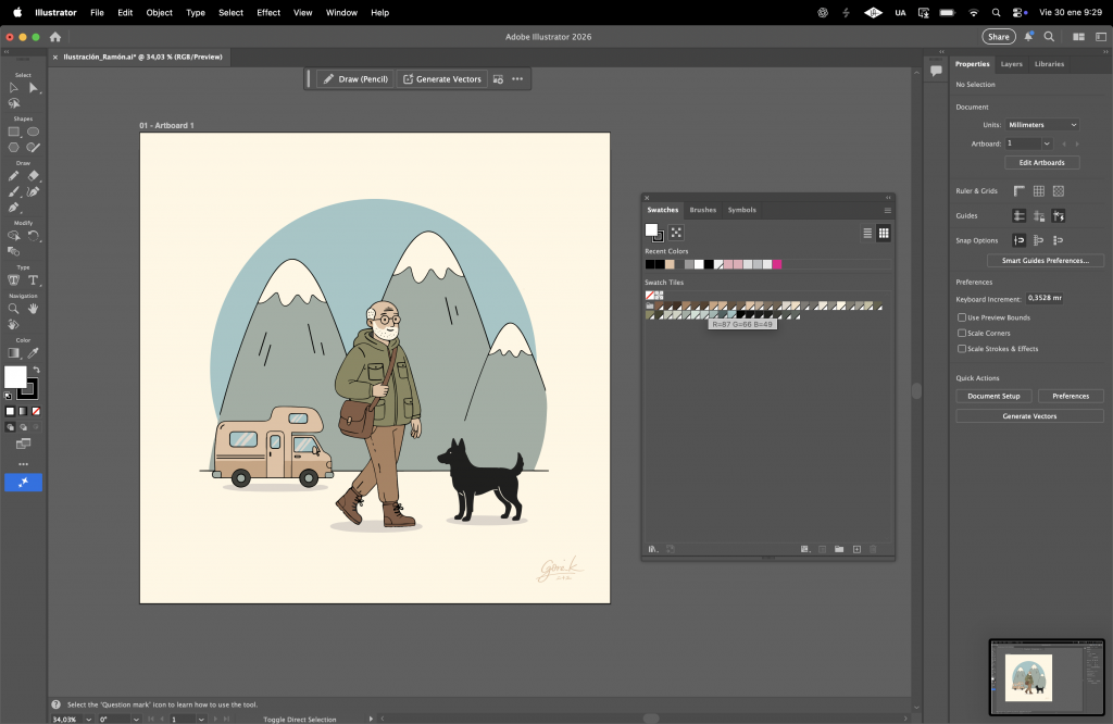
A man walking, accompanied by his dog, with the mountains behind him and his camper van nearby. A quiet moment, frozen in time, that reflects a full life without needing grand gestures.
Why We Sometimes Illustrate
At Nijusan Studio, we don’t illustrate every day — and we’re okay with that. Illustration, for us, is a tool, not a label. When a project asks for something personal, human, and story-driven, we step into it with honesty and care.
This illustration for Pedro is exactly that: a small visual story, built slowly, thoughtfully, and with respect for the person behind it.
And sometimes, that’s more than enough.